01
Overview
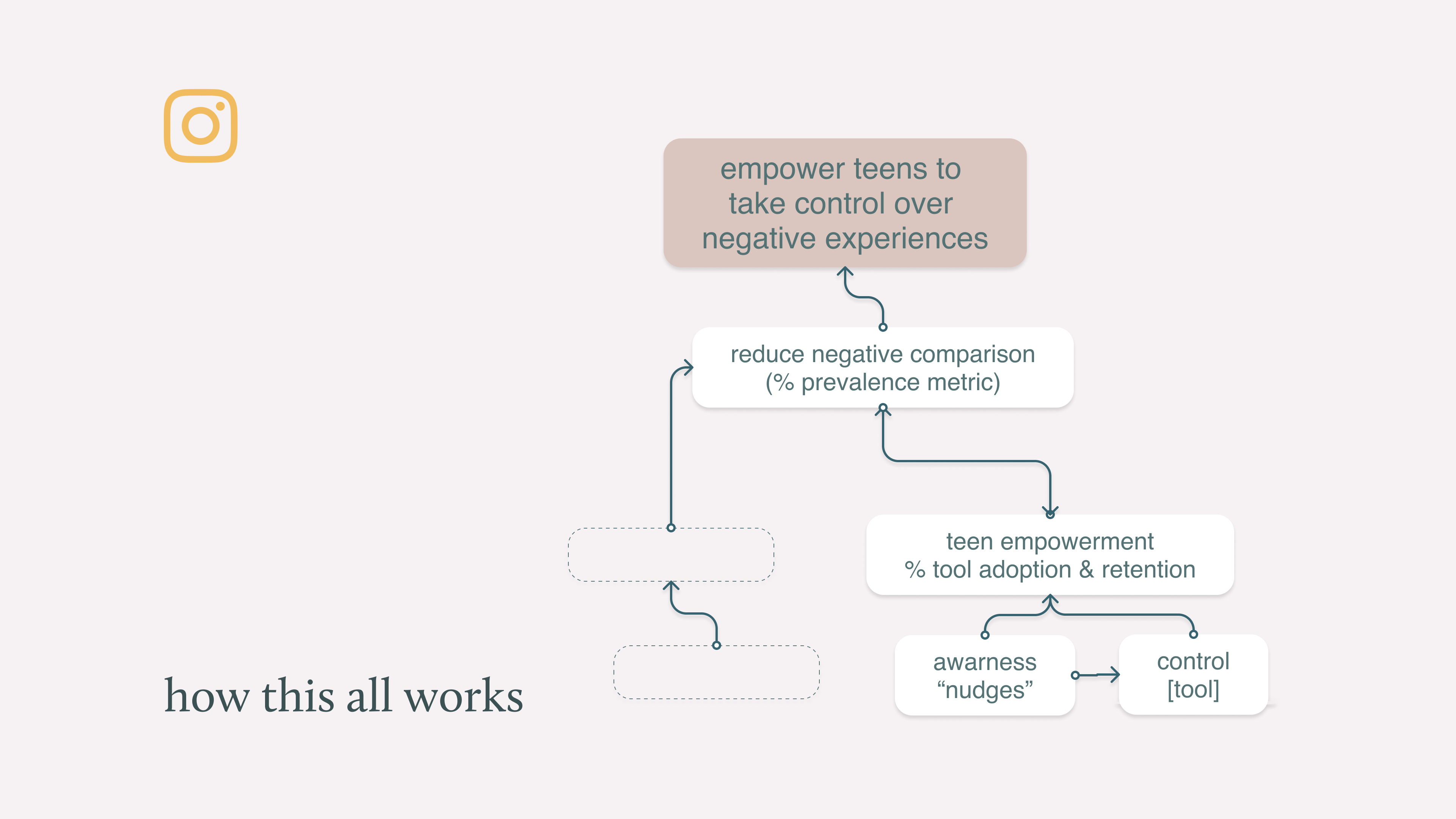
Social media's impact on teen mental health had become impossible to ignore — and Instagram was at the center of it. I joined Meta's mental health team because I believed that if we could build the right tools inside the product, we could actually help young people use Instagram in a way that served them. This project was one of the first visible features the team shipped: in-product interventions — "nudges" — that interrupted negative social comparison behavior in real time and gave teens a way to act on what they were feeling.
Impact
Starting with a problem this broad required building a shared definition before any design work could begin. I led co-design sessions with an external therapist and global partners — people who work with this problem professionally — to make sure the team wasn't designing from assumptions. The goal was to understand how negative social comparison actually manifests on Instagram, and what kinds of interventions could realistically interrupt it.
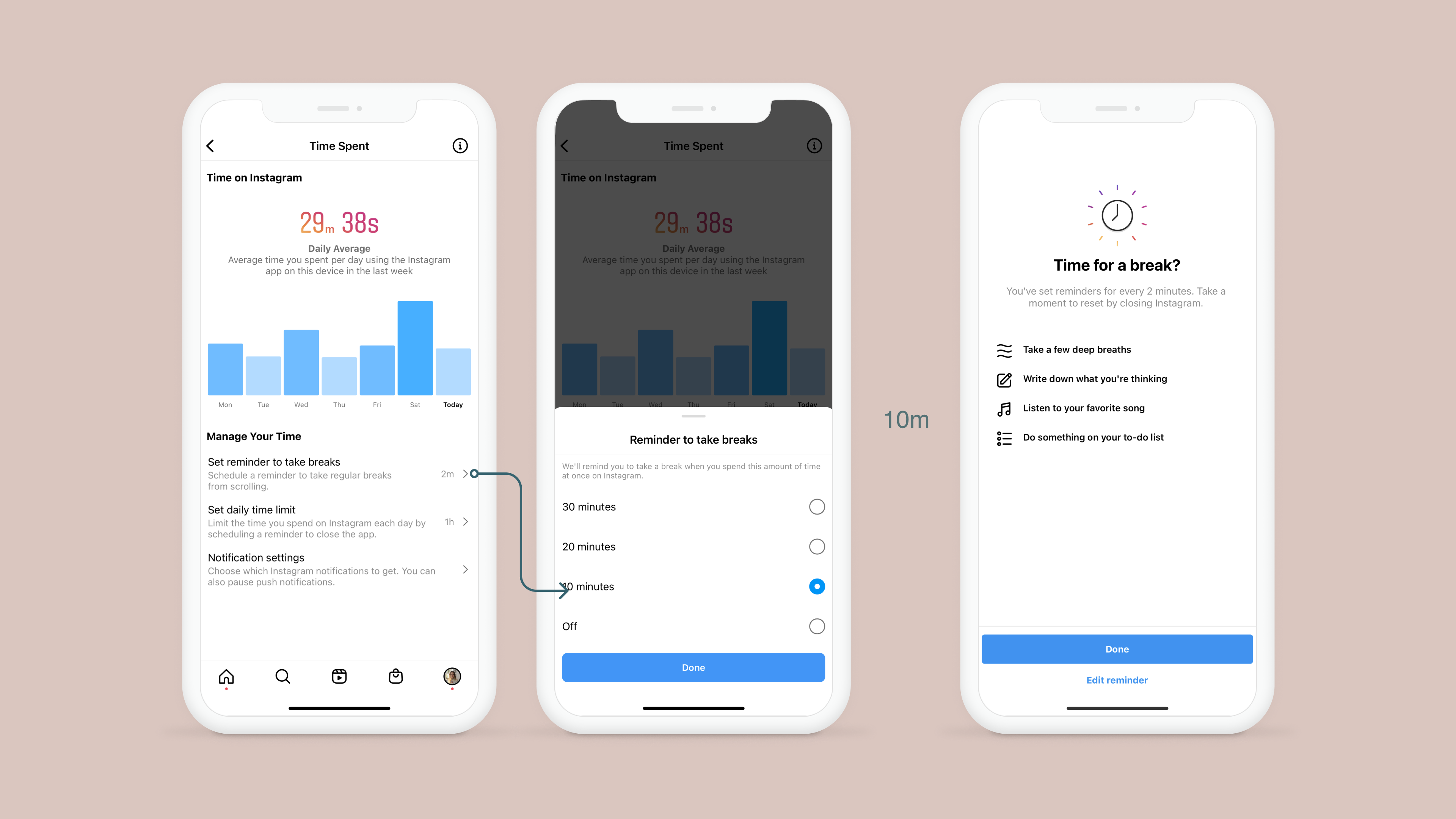
Through that process, we landed on "nudges" — moments of behavior interruption, triggered by clear behavioral signals, that helped teens notice when they were in a negative spiral and gave them something to do about it.
The nudge had to feel supportive, not punitive — like the app noticing something and gently checking in, rather than flagging a problem. Content design was critical here: the language had to be non-judgmental, give teens a clear sense of what triggered the nudge, and offer a path forward that felt like their choice.
I owned both the UX and content design for the feature, which meant the words and the interface were built together rather than retrofitted. That integration was important — the copy and the UI needed to feel like a single, coherent voice.
The feature launched under time pressure — the timeline was accelerated following the leak of internal research on teen well-being — and Instagram was vocal about it publicly. The launch was part of a broader set of announcements about Instagram's approach to teen safety, and it received significant press coverage.
From colleagues still at the company, the feature had measurable impact on getting teens out of negative social comparison cycles. Specific metrics are under NDA, but the directional signal was positive.
The launch was covered by Bloomberg as part of Instagram's "Take a Break" initiative — one of the first times the company had publicly committed to features specifically designed to help teens self-regulate their usage.
The external response — from parents, advocates, and the press — validated the team's belief that visible, honest features in this space were worth building, even when the business case was harder to make.
Key Decisions
Supportive, not punitive
The nudge had to feel like the app gently checking in — not flagging a problem. I owned both UX and content design, which meant the words and interface were built together as a single voice. The language had to be non-judgmental, explain the trigger clearly, and offer a path forward that felt like the teen's choice.
Never target individuals
A critical design principle: negative comparison is not individual. No single user, creator, or community causes it. The design could never nudge someone away from a specific person — that would be harmful. This constraint shaped the entire trigger system and kept the feature honest.
01